Rhythmic Ambiance.
Three crucial iterations.
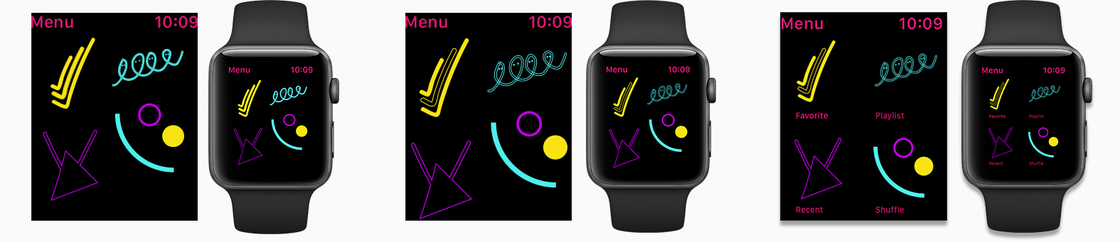
1.) User testing showed that the icons needed to be more cohesive.
2.) To achieve cohesiveness, each icon received an outlined element.
3.) The final design included the placement and refinement of typography.

1.) Users felt that the display looked too clean. It lacked vivaciousness and vitality.
2.) To be more exciting, images were enlarged, and electrifying background elements were added.
3.) Legibility was increased by moving graphics below an artist’s name. The outline of the artist’s image was thickened and jagged to help differentiate it from the album images.