Mojito Plaza.
Three crucial iterations.
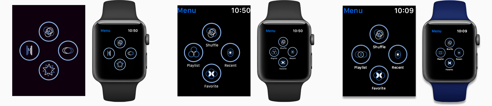
1.) Having some icons be line-based felt too rigid and went against the visual direction of Mojito Plaza.
2.) Modified icons so that they all were circular designed.
3.) Finalized icons were improved to be more cohesive.
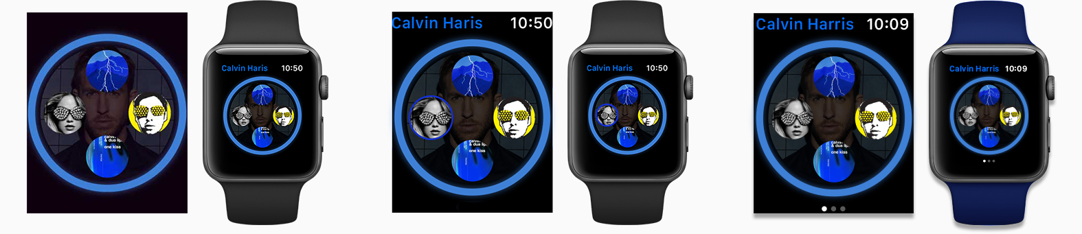
1.) Users had no difficulties selecting an album. They found the task to be straightforward.
2.) Experimented with adding a call to action for selecting an album.
3.) Users preferred original design; however, they liked having page indications to let them know how many more albums were available.