DISCOVER THE BAD GUY
Overview
This was a project from my graduate experiential graphic design class.
Students were to design a 5x8’ panel for an interesting person to know about that could be used within a museum or event.
This was a project from my graduate experiential graphic design class.
Students were to design a 5x8’ panel for an interesting person to know about that could be used within a museum or event.
Objectives
1.) Explore and elaborate many options for environmental graphic design message-making
2.) Investigate simple to complex design process related to verbal and visual message development
3.) Understand options for meaningful visual and informational hierarchy
4.) Explore audience experiences and interaction possibilities
Criteria
The Concept
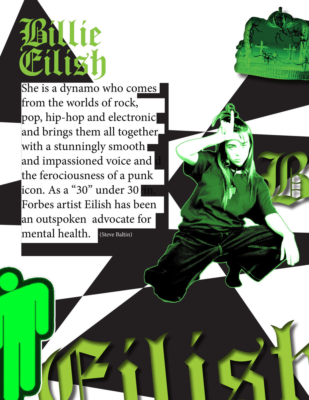
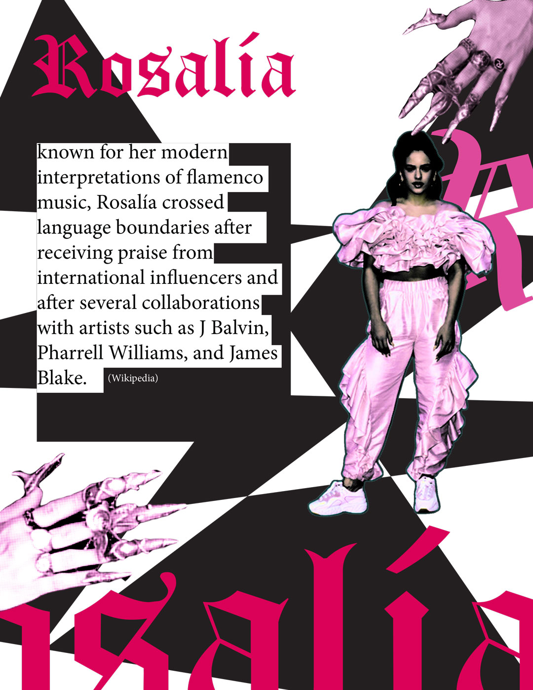
Showcase a singer who has gained a fast following due to their unique musical stylings within the music industry. Two artists that were considered for the panel were Billie Eilish and Rosalía.
Both singers have disrupted the music industry primarily based on their music’s popularity, which doesn’t fit any genre. Billie with her dark amorphous indie electronic pop, and Rosalía with her contemporary interpretation of flamenco.
I ended up proceeding with Billie’s panel design over Rosalía because Billie already had a more established design style/brand. It was much quicker to analyze Billie and determine how to transfer her design aesthetic onto components for the panel.
Panel Elements
Panel Design
Billie’s music videos served as the theme and design inspiration for the panel.
The panel consists of three informational sections about Billie.
• Music
• Tourette syndrome
• Style choice
The panel was designed on a 5x4 grid system. Some images purposely went against the grid to envoke that edgy quality Billie possesses.


Panel Typography
Keywords are soft and delicate, juxtaposing Billie’s perceived image as a disturbed girl vs. her poetic lyrics and her personal struggles.
Panel writing is from articles written by:Josh Eells, Brea Cubit, Jasmine Gomez, Brittany Spanos.
Keywords are soft and delicate, juxtaposing Billie’s perceived image as a disturbed girl vs. her poetic lyrics and her personal struggles.
Panel writing is from articles written by:Josh Eells, Brea Cubit, Jasmine Gomez, Brittany Spanos.


Hand Letter Logo
The hand-lettered logo was inspired by Billie’s cover art lettering for the album “When We All Fall Asleep, Where Do We Go?”. It was designed to be an ire peculiarity zombified version of Billie.
The letters “L” and “I” in the name “Billie” is a motif for Billie’s Blohsh emblem; these two letters were combined to look like a walking zombie.
The title of the letter “I” serves as the head, while the upside-down letter “L” is the body with stretched out arms.
Panel Experiments
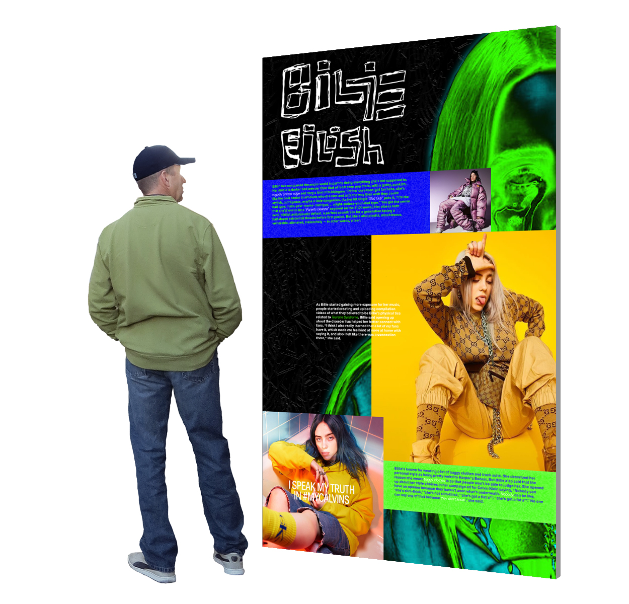 2D panel: Developed layout for a 2D floor-mounted panel.
 2D panel + relief: Spiderweb background correlates to Billie’s gothic vibe while adding a tactile texture.
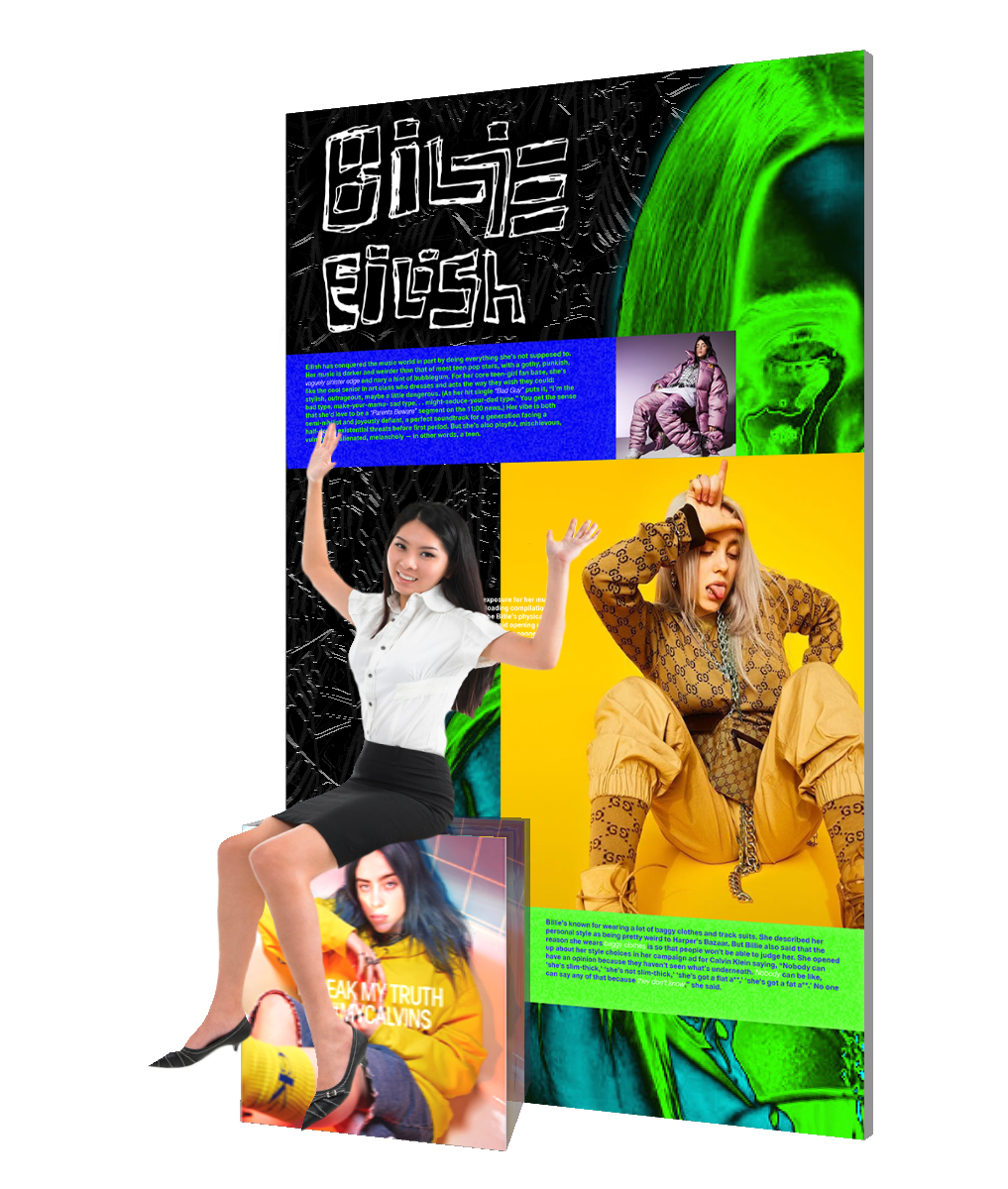
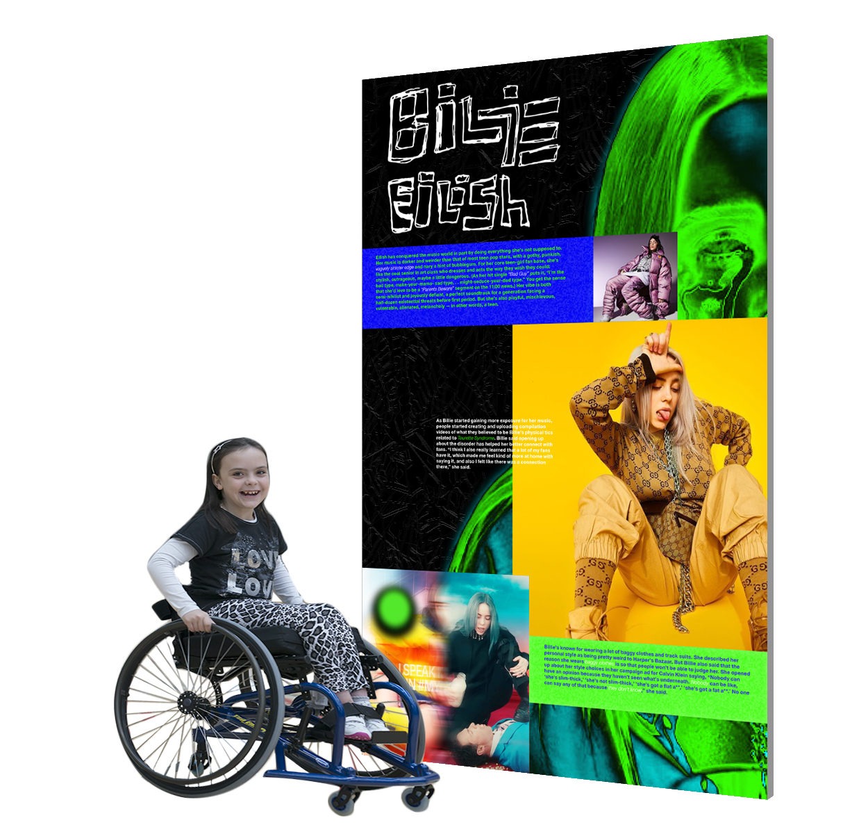
2D panel + relief: The bottom left photo becomes a resting spot for visitors. Guests may also use this spot to take a picture with Billie.
 2D + edge: Billie’s skewed Blohsh logo looks ominously over her shoulder, creating tension between guests and the design panel.
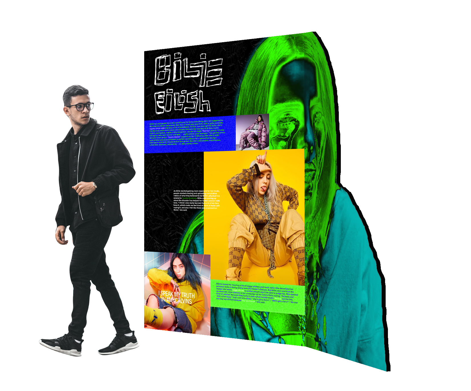 2D + corner: Curved corner completing Billie’s face conceives intimate seclusion between guest and Billie’s ocean eyes.
 2D + corner: Guests can climb and play on a replicated ladder that’s featured on Billie’s album cover, “Don’t Smile at Me.”
 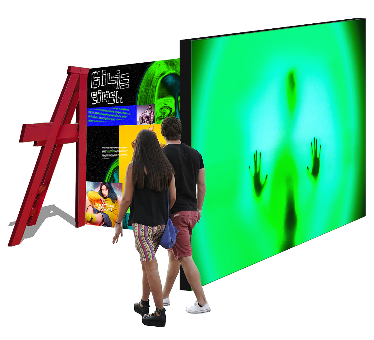 Light/Shadow: The wall outside the exhibition showcases mysterious silhouettes created by the guests who are already inside the exhibit.
Projection: Spiders from Billie’s
music video “You should see me in a crown” appear crawling all over the panel, surprising guests when they least expect it.
 Interaction: Swipe images to discover hidden content like music videos and messages from Billie.
 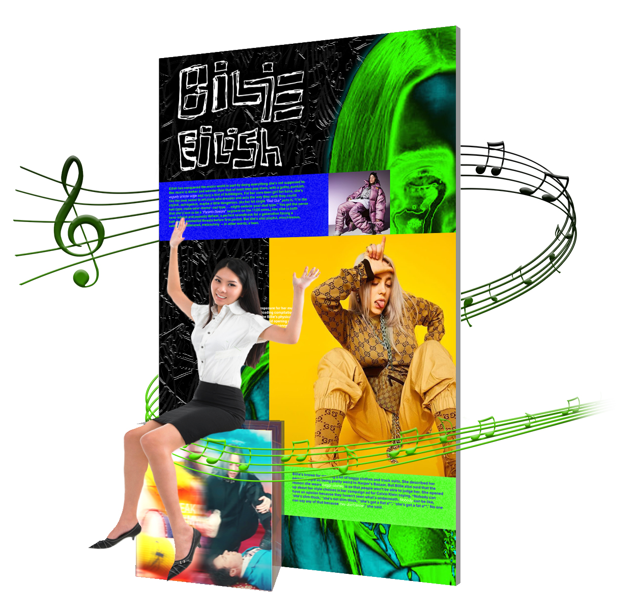 2D + relief + interaction: Sit down to activate a personalized mini Billie concert. Videos of past shows are revealed with surround sound audio.
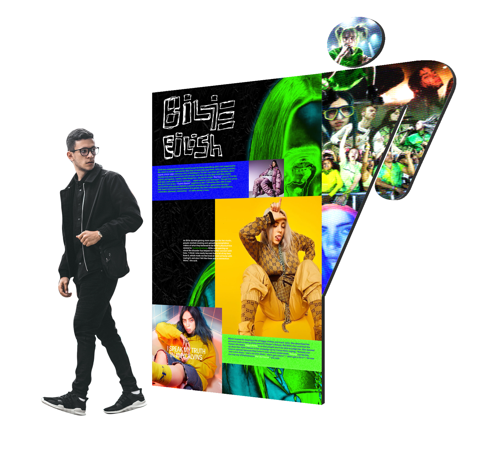 2D panel + edge + projection: A movie collage montage of Billie features never before seen moments from her studio sessions, concerts, and fans’ messages.
2D panel + corner + interaction: Sing along to your favorite Billie Eilish song with interactive karaoke.